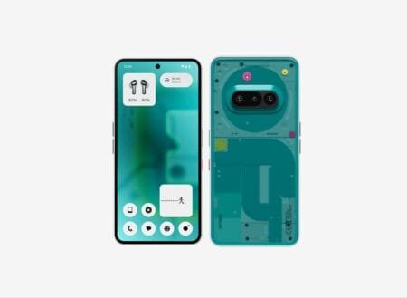
Nothing OS 4.0 started rolling out to users this week, introducing new features and refinements for Nothing Phone devices. While the update includes performance improvements and customization options, it has sparked debate among users and designers over changes to the status bar icons—a key element of Nothing’s minimalist interface.
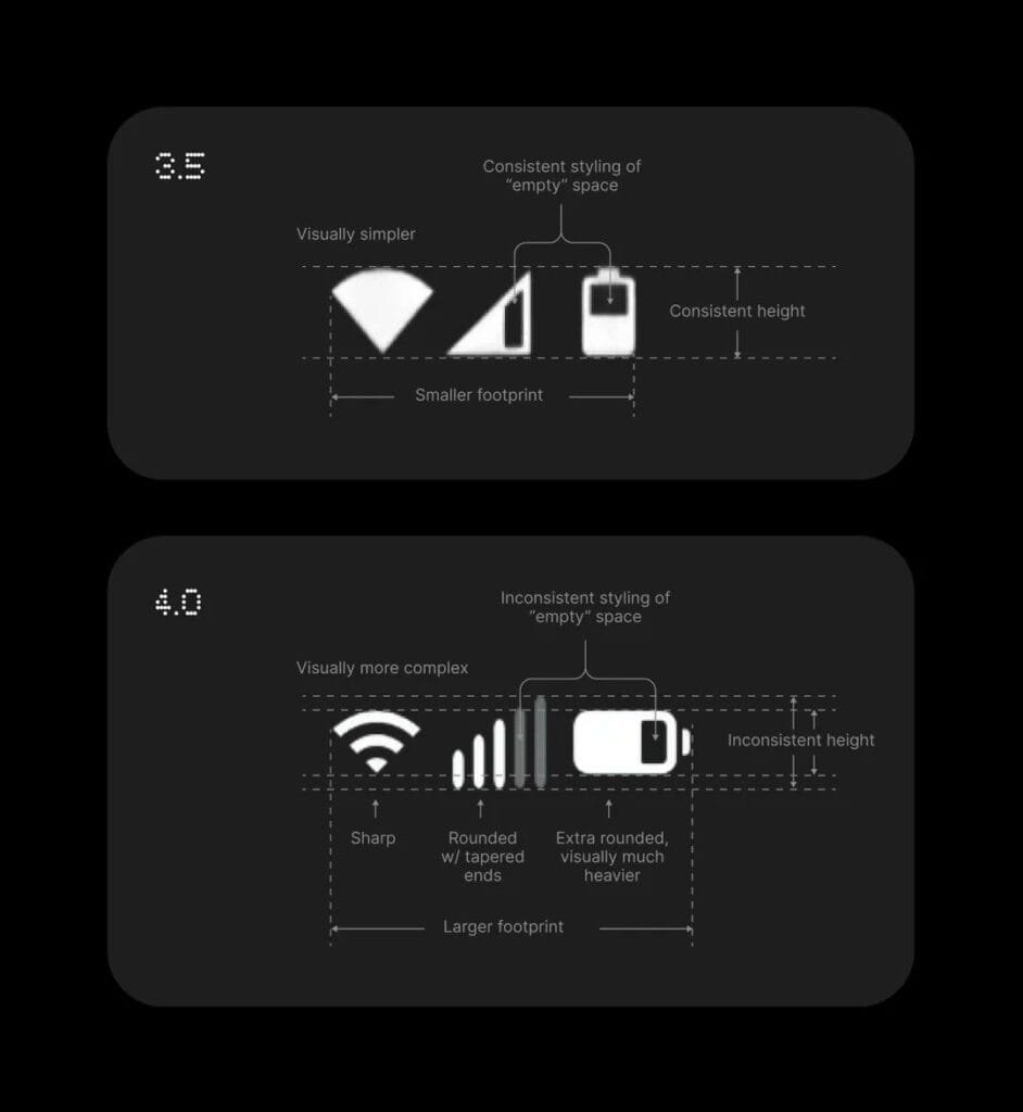
A professional designer with 10 years of experience in iconography and UI systems shared a critical review of the redesigned status bar after testing the stable release on their Nothing Phone 3. In a social media post, they argued the update sacrifices clarity and consistency:
“I know everyone is very excited about the status bar update, so I assume I’m an outlier here. I’m a professional designer that has been making (among other things) icons and design systems for about 10 years now. This change, by my evaluation, is a downgrade.”
The critique focused on the cellular data icon, which appears stretched vertically with uneven tapered ends. While acknowledging this might be a bug, the designer doubled down:
“Please note that the inconsistent height and tapered ends of the data icon may be a bug. It appears that the data icon is being stretched vertically, which would account for both of those things. Despite that, I still feel like we moved in the wrong direction here.”
Side-by-side screenshots shared by the designer compared the stable release to the beta version, highlighting regressions in spacing and alignment.
What’s in the Stable Release?
Beyond the status bar debate, Nothing OS 4.0 adds several improvements:
- Glyph Interface Customization: New lighting effects for notifications, calls, and app alerts.
- Performance Upgrades: Smoother animations and faster app launches.
- Battery Health Tools: Adaptive charging to reduce long-term wear.
- Privacy Dashboard: Real-time tracking of app permissions.
Many users have praised these features, but the status bar changes—a core visual element for daily use—remain divisive.
Community Reactions
Nothing’s fanbase, which often celebrates the brand’s quirky, detail-focused design language, appears split. On forums, some argue the icon tweaks are minor compared to the update’s technical upgrades. Others, however, side with the designer:
“If Nothing’s whole vibe is ‘premium minimalism,’ sloppy icons undermine that,” wrote one user on Reddit.
Nothing has yet to respond publicly to the criticism. Historically, the company has addressed UI complaints quickly—like adjusting icon spacing in OS 2.0 after user feedback—so a future patch could resolve the issue.
Why This Matters
The backlash highlights a common struggle for tech brands: balancing innovation with consistency. For Nothing, whose identity hinges on sleek, intentional design, even small missteps risk alienating users who expect pixel-perfect execution.
Whether the status bar changes stay or go may depend on how many users echo the designer’s concerns. For now, the debate continues—one jagged icon at a time.
Source: Reddit
Discover more from wazzuptechph
Subscribe to get the latest posts sent to your email.


